Yane's Site
My classwork from BIMM143
Class 9 Candy Mini Project
Yane Lee PID A17670350 2026-02-08
This mini-project will allow us to apply our data analysis skills and build on our PCA skills.
candy_file <- "candy-data.csv"

candy = read.csv(candy_file, row.names=1)
# head(candy)
Q1. How many different candy types are in this dataset?
nrow(candy)
[1] 85
Q2. How many fruity candy types are in the dataset?
sum(candy$fruity)
[1] 38
winpercent is the percentage of people who prefer a given candy over
another randomly chosen candy from the dataset. Higher values indicate a
more popular candy.
We can find the winpercent value for Twix by using its name to access the corresponding row of the dataset.
candy["Twix", ]$winpercent
[1] 81.64291
Alternatively, you can do this…
# install.packages("vctrs")
# install.packages("dplyr")

library(dplyr)
Attaching package: 'dplyr'

The following objects are masked from 'package:stats':

    filter, lag

The following objects are masked from 'package:base':

    intersect, setdiff, setequal, union
candy |>
  filter(row.names(candy)=="Twix") |>
  select(winpercent)
     winpercent
Twix   81.64291
Q3. What is your favorite candy (other than Twix) in the dataset and what is it’s winpercent value? My favorite candy is Snickers
# This is the winpercent value of the Snickers
candy["Snickers", ]$winpercent
[1] 76.67378
Q4. What is the winpercent value for “Kit Kat”?
candy["Kit Kat", ]$winpercent
[1] 76.7686
Q5. What is the winpercent value for “Tootsie Roll Snack Bars”?
candy["Tootsie Roll Snack Bars", ]$winpercent
[1] 49.6535
There is a useful skim() function in the skimr package that can help give you a quick overview of a given dataset.
# install.packages("skimr")
library("skimr")
skim(candy)
| Name | candy |
| Number of rows | 85 |
| Number of columns | 12 |
| _______________________ | |
| Column type frequency: | |
| numeric | 12 |
| ________________________ | |
| Group variables | None |
Data summary
Variable type: numeric
| skim_variable | n_missing | complete_rate | mean | sd | p0 | p25 | p50 | p75 | p100 | hist |
|---|---|---|---|---|---|---|---|---|---|---|
| chocolate | 0 | 1 | 0.44 | 0.50 | 0.00 | 0.00 | 0.00 | 1.00 | 1.00 | ▇▁▁▁▆ |
| fruity | 0 | 1 | 0.45 | 0.50 | 0.00 | 0.00 | 0.00 | 1.00 | 1.00 | ▇▁▁▁▆ |
| caramel | 0 | 1 | 0.16 | 0.37 | 0.00 | 0.00 | 0.00 | 0.00 | 1.00 | ▇▁▁▁▂ |
| peanutyalmondy | 0 | 1 | 0.16 | 0.37 | 0.00 | 0.00 | 0.00 | 0.00 | 1.00 | ▇▁▁▁▂ |
| nougat | 0 | 1 | 0.08 | 0.28 | 0.00 | 0.00 | 0.00 | 0.00 | 1.00 | ▇▁▁▁▁ |
| crispedricewafer | 0 | 1 | 0.08 | 0.28 | 0.00 | 0.00 | 0.00 | 0.00 | 1.00 | ▇▁▁▁▁ |
| hard | 0 | 1 | 0.18 | 0.38 | 0.00 | 0.00 | 0.00 | 0.00 | 1.00 | ▇▁▁▁▂ |
| bar | 0 | 1 | 0.25 | 0.43 | 0.00 | 0.00 | 0.00 | 0.00 | 1.00 | ▇▁▁▁▂ |
| pluribus | 0 | 1 | 0.52 | 0.50 | 0.00 | 0.00 | 1.00 | 1.00 | 1.00 | ▇▁▁▁▇ |
| sugarpercent | 0 | 1 | 0.48 | 0.28 | 0.01 | 0.22 | 0.47 | 0.73 | 0.99 | ▇▇▇▇▆ |
| pricepercent | 0 | 1 | 0.47 | 0.29 | 0.01 | 0.26 | 0.47 | 0.65 | 0.98 | ▇▇▇▇▆ |
| winpercent | 0 | 1 | 50.32 | 14.71 | 22.45 | 39.14 | 47.83 | 59.86 | 84.18 | ▃▇▆▅▂ |
Q6. Is there any variable/column that looks to be on a different scale to the majority of the other columns in the dataset? The column with the types of candy are different because it’s not a numerical scale
Q7. What do you think a zero and one represent for the candy$chocolate column? The zero means that there isn’t chocolate in that specific candy, and a one means that there is choclate in that specific candy
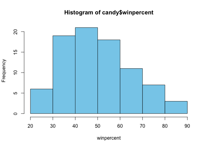
Q8. Plot a histogram of winpercent values using both base R an ggplot2.
hist(candy$winpercent, xlab = "winpercent", col = "skyblue")
# install.packages("ggplot2")
library(ggplot2)
ggplot(candy, aes(x = winpercent)) +
  geom_histogram( binwidth = 5, fill = "skyblue", color = "black") +
  labs( x = "Win Percent",
       y = "Count")
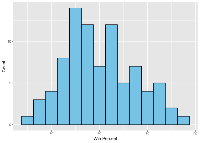
Q9. Is the distribution of winpercent values symmetrical? They are not symmetrical
Q10. Is the center of the distribution above or below 50%?
mean(candy$winpercent)
[1] 50.31676
median(candy$winpercent)
[1] 47.82975
Q11. On average is chocolate candy higher or lower ranked than fruit candy?
avg_chocolate <- mean(candy$winpercent[as.logical(candy$chocolate)])
avg_fruity <- mean(candy$winpercent[as.logical(candy$fruity)])
avg_chocolate > avg_fruity
[1] TRUE
Q12. Is this difference statistically significant?
t.test(
  candy$winpercent[as.logical(candy$chocolate)],
  candy$winpercent[as.logical(candy$fruity)]
)
    Welch Two Sample t-test

data:  candy$winpercent[as.logical(candy$chocolate)] and candy$winpercent[as.logical(candy$fruity)]
t = 6.2582, df = 68.882, p-value = 2.871e-08
alternative hypothesis: true difference in means is not equal to 0
95 percent confidence interval:
 11.44563 22.15795
sample estimates:
mean of x mean of y
 60.92153  44.11974
Q13. What are the five least liked candy types in this set?
# head(candy[order(candy$winpercent),], n=5)
Q14. What are the top 5 all time favorite candy types out of this set?
# head(candy[order(candy$winpercent, decreasing=TRUE),], n=5)
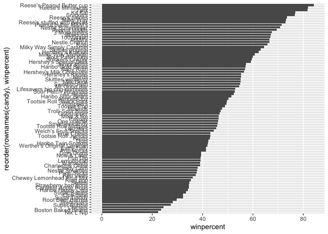
Q15. Make a first barplot of candy ranking based on winpercent values.
library(ggplot2)

ggplot(candy) +
  aes(winpercent, reorder(rownames(candy), winpercent)) +
  geom_col()
Let’s setup a color vector that signifies candy type.
my_cols=rep("black", nrow(candy))
my_cols[as.logical(candy$chocolate)] = "pink"
my_cols[as.logical(candy$bar)] = "maroon"
my_cols[as.logical(candy$fruity)] = "orange"

ggplot(candy) +
  aes(winpercent, reorder(rownames(candy),winpercent)) +
  geom_col(fill=my_cols)
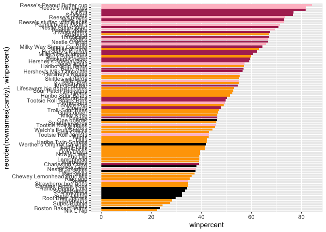
Now, for the first time, using this plot we can answer questions like:
Q17. What is the worst ranked chocolate candy?
# head(candy[order(candy$winpercent),], n=1)
Q18. What is the best ranked fruity candy?
fruity_candy <- candy[as.logical(candy$fruity),]
fruity_candy[which.max(fruity_candy$winpercent), ]
          chocolate fruity caramel peanutyalmondy nougat crispedricewafer hard
Starburst         0      1       0              0      0                0    0
          bar pluribus sugarpercent pricepercent winpercent
Starburst   0        1        0.151         0.22   67.03763
The pricepercent variable records the percentile rank of the candy’s price against all the other candies in the dataset. Lower values are less expensive and higher values are more expensive.
# install.packages("ggrepel")
library(ggrepel)

ggplot(candy) +
  aes(x = pricepercent,
      y = winpercent, label=rownames(candy)) +
  geom_point(col=my_cols) +
  geom_text_repel(col=my_cols, size=3.3, max.overlaps = 5)
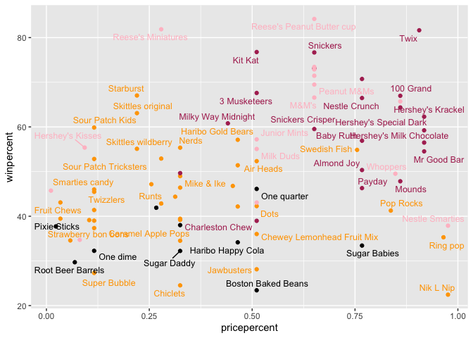
Q19. Which candy type is the highest ranked in terms of winpercent for the least money - i.e. offers the most bang for your buck?
ord <- candy[order(candy$pricepercent, -candy$winpercent), ]
head( ord, 1 )
                     chocolate fruity caramel peanutyalmondy nougat
Tootsie Roll Midgies         1      0       0              0      0
                     crispedricewafer hard bar pluribus sugarpercent
Tootsie Roll Midgies                0    0   0        1        0.174
                     pricepercent winpercent
Tootsie Roll Midgies        0.011   45.73675
Q20. What are the top 5 most expensive candy types in the dataset and of these which is the least popular?
most_expensive <- candy[order(-candy$pricepercent), ]

head(most_expensive, 5)
                         chocolate fruity caramel peanutyalmondy nougat
Nik L Nip                        0      1       0              0      0
Nestle Smarties                  1      0       0              0      0
Ring pop                         0      1       0              0      0
Hershey's Krackel                1      0       0              0      0
Hershey's Milk Chocolate         1      0       0              0      0
                         crispedricewafer hard bar pluribus sugarpercent
Nik L Nip                               0    0   0        1        0.197
Nestle Smarties                         0    0   0        1        0.267
Ring pop                                0    1   0        0        0.732
Hershey's Krackel                       1    0   1        0        0.430
Hershey's Milk Chocolate                0    0   1        0        0.430
                         pricepercent winpercent
Nik L Nip                       0.976   22.44534
Nestle Smarties                 0.976   37.88719
Ring pop                        0.965   35.29076
Hershey's Krackel               0.918   62.28448
Hershey's Milk Chocolate        0.918   56.49050
top5_expensive <- head(most_expensive, 5)
least_pop_expensive <- top5_expensive[order(top5_expensive$winpercent), ]

least_pop_expensive[1, ]
          chocolate fruity caramel peanutyalmondy nougat crispedricewafer hard
Nik L Nip         0      1       0              0      0                0    0
          bar pluribus sugarpercent pricepercent winpercent
Nik L Nip   0        1        0.197        0.976   22.44534
Q21. Optional…
Now that we’ve explored the dataset a little, we’ll see how the variables interact with one another. We’ll use correlation and view the results with the corrplot package to plot a correlation matrix.
# install.packages("corrplot")
library(corrplot)
corrplot 0.95 loaded
cij <- cor(candy)
corrplot(cij)
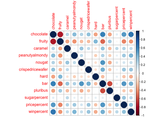
Q22. Examining this plot what two variables are anti-correlated (i.e. have minus values)? Fruity and chocolate candies
Q23. Similarly, what two variables are most positively correlated? Chocolate and peanutyalmondy
pca <- prcomp(candy, scale = TRUE)
summary(pca)
Importance of components:
                          PC1    PC2    PC3     PC4    PC5     PC6     PC7
Standard deviation     2.0788 1.1378 1.1092 1.07533 0.9518 0.81923 0.81530
Proportion of Variance 0.3601 0.1079 0.1025 0.09636 0.0755 0.05593 0.05539
Cumulative Proportion  0.3601 0.4680 0.5705 0.66688 0.7424 0.79830 0.85369
                           PC8     PC9    PC10    PC11    PC12
Standard deviation     0.74530 0.67824 0.62349 0.43974 0.39760
Proportion of Variance 0.04629 0.03833 0.03239 0.01611 0.01317
Cumulative Proportion  0.89998 0.93832 0.97071 0.98683 1.00000
Q24. Complete the code to generate the loadings plot above. What original variables are picked up strongly by PC1 in the positive direction? Do these make sense to you? Where did you see this relationship highlighted previously?
plot(pca$x[, 1:2], col=my_cols, pch=16)
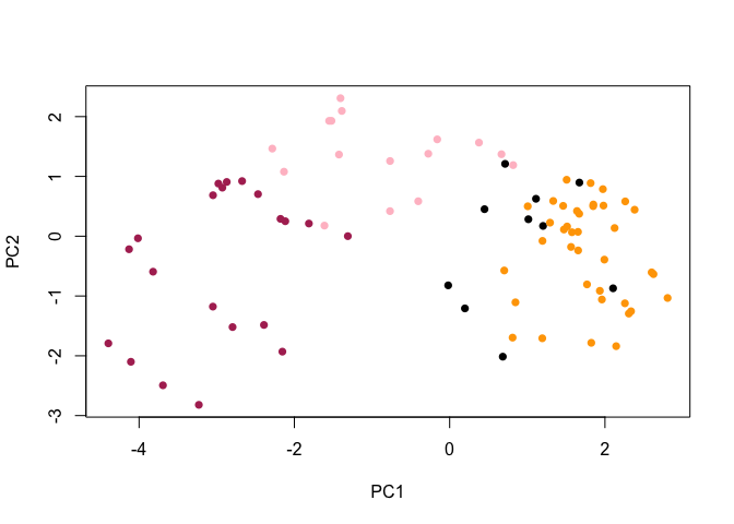
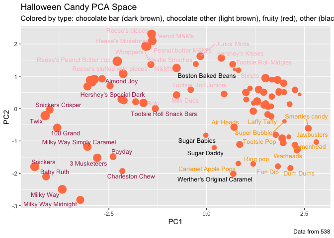
my_data <- cbind(candy, pca$x[,1:3])

p <- ggplot(my_data) +
        aes(x=PC1, y=PC2,
            size=winpercent/100,
            text=rownames(my_data),
            label=rownames(my_data)) +
        geom_point(col="coral")
library(ggrepel)

p + geom_text_repel(size=3.3, col=my_cols, max.overlaps = 7)  +
  theme(legend.position = "none") +
  labs(title="Halloween Candy PCA Space",
       subtitle="Colored by type: chocolate bar (dark brown), chocolate other (light brown), fruity (red), other (black)",
       caption="Data from 538")
# install.packages("plotly")

library(plotly)
Attaching package: 'plotly'

The following object is masked from 'package:ggplot2':

    last_plot

The following object is masked from 'package:stats':

    filter

The following object is masked from 'package:graphics':

    layout
ggplotly(p)
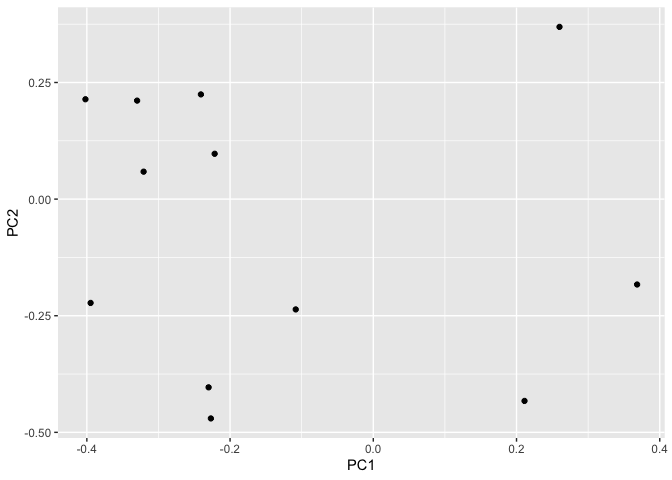
ggplot(pca$rotation) +
  aes(x = PC1, y = PC2) +
  geom_point()
Q25. Based on your exploratory analysis, correlation findings, and PCA results, what combination of characteristics appears to make a “winning” candy? How do these different analyses (visualization, correlation, PCA) support or complement each other in reaching this conclusion? Overall, a “winning” candy tends to be chocolate-based, often with peanut/almond or nougat, and not hard or strongly fruity. Visualizations showed that these candies consistently rank higher in winpercent. Correlation analysis confirmed positive relationships between chocolate-related features and popularity, while fruity and hard candies were less favored. PCA tied these results together by showing that chocolate, nutty ingredients, and winpercent drive the main variation in the data, reinforcing the same conclusion from multiple perspectives.